Poor air quality in Denver, CO experienced by some racial and socioeconomic groups more than others

Image
Livestock exchange

Explore the Data

PhenomenonInequities in Denver, Colorado air quality (NO2 and PM2.5) over a full year, 2019
LocationDenver, CO
Dataset8 variables for each of the 640 census tracts in Denver, CO from 2019. These variables include indicators of poor air quality, race, and socioeconomic status. 
Data Visualization Typesscatter plots, line plots
Big Science IdeasEnvironmental justice


How to play with the data below:CODAP tutorial

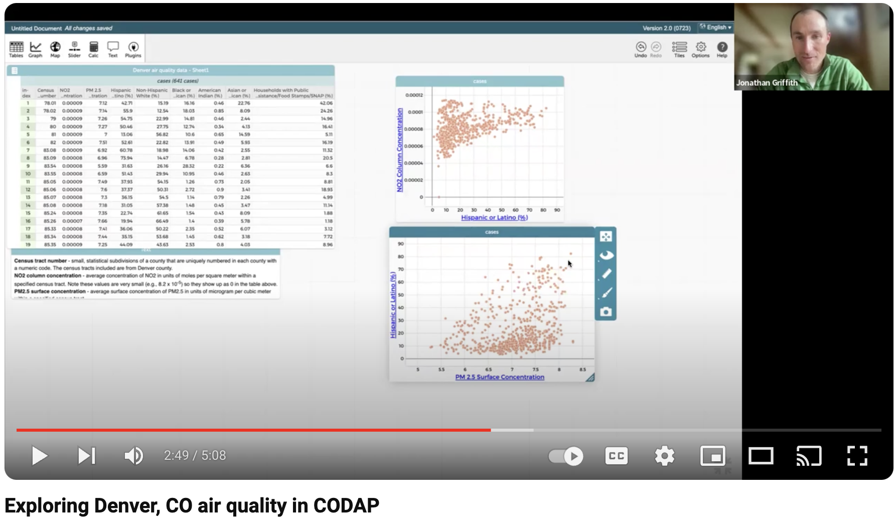
  • Click and drag variables from the data table to the x and/or y axis to the pre-populated graphs or a create graph of your own by selecting the graph icon in the upper left corner of the window. 
  • Watch this video to learn more about leveraging the functionality of CODAP to explore the air quality dataset below.

                                                   Google Sheets                                                 What is Google Slides? | Technology Enhanced Learning at SHU

Data in CODAP                                      Data in Google Sheets                         Graphs in Google Slides

About the Data:

The data above includes 8 variables for each of the 640 census tracts in Denver, CO from 2019 including indicators of poor air quality: average concentration of inhalable particulate matter smaller than 2.5 micrometers in diameter (PM2.5) and nitrogen dioxide (NO2) for the year 2019**; Race: percentage of Hispanic, Non-Hispanic White, Black, American Indian, and Asian people; Socioeconomic status: percentage of households with Public Assistance/Food Stamps/SNAP.

**A year of data was chosen because it provides a more accurate overall picture by looking over time across things like seasonality of pollution exposure. Scientists selected 2019 specifically because they did not want any interference from covid-related changes in emissions, believing that business as usual emissions will likely go back to closer to pre-covid (pre-2020) levels. 


Possible questions to consider when analyzing the data:

  • How do nitrogen dioxide (NO2) concentrations relate to the percentage of different racial and socioeconomic groups in Denver census tracts?
  • How do small particulate matter (PM2.5) concentrations relate to the percentage of different racial and socioeconomic groups in Denver census tracts? 
  • Which groups (race, socioeconomic) experienced the worst air quality in Denver in 2019?

What other pattern(s) did you notice/see/find?

Some pattern(s) we notice/see/find:

  • Census tracts with higher percentages of Hispanics, American Indians, or Black people are more likely to experience high concentrations of NO2 and PM2.5
  • Census tracts with a high percentage of White or Asian people are more likely to experience lower concentrations of NO2 and PM2.5 
    • We noticed that there are many census tracts that have a high percentage of White or Asian people that also have high concentrations of NO2 and PM2.5. 
      • Pattern Interpretation: These patterns suggests that census tracts that have a high percentage of White or Asian people are more likely to have good air quality but that it doesn't guarantee that these census tracts will have good air quality.
  • Census tracts with a high percentage of people who qualify for public assistance are more likely to experience high concentrations of NO2 and PM2.5

What other pattern(s) did you notice/see/find?
_______________________________________________________________________________________________________

Data in Context

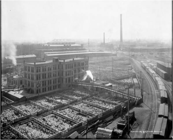
Gold found in Cherry Creek and in the South Platte River brought an influx of people to Denver in the early 1900s. With these settlers brought new businesses which included metal refinement, making steel rails for railroads, livestock trading, among many others. As these industries grew, so too did the transportation demands to move these goods. First trains, then major highways were constructed next to established industries to transport more and more goods. Booming business along these busy transportation corridors led to a rise in air and water pollution and ultimately, made these areas less desirable places to live. The picture (right) shows the Denver Union Stock Yards Company cattle pens and the Omaha and Grant smelter smokestack in the distance, circa 1915. (Louis Charles McClure/Denver Public Library/Western History Collection/MCC-4205). Source.

Livestock exchange
Denver redline map

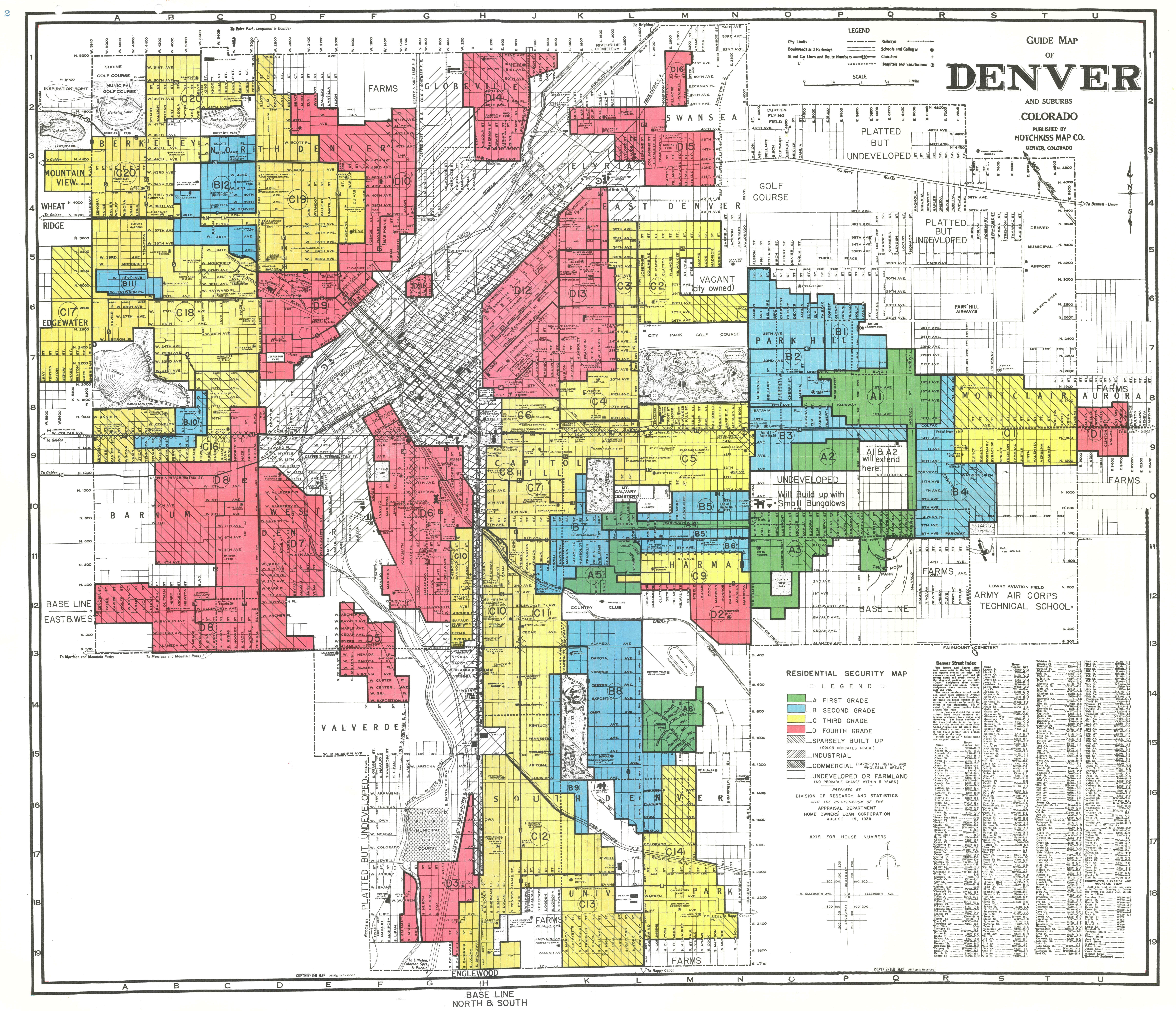
In the 1930s and 40s, people who could afford it, moved farther away and upwind from these industrial/transportation corridors thereby segregating communities by socioeconomic status. At the same time, US government-sponsored housing practices further segregated communities by 1) subsidizing builders who were constructing suburban housing away from the industrial/transportation corridors for White people only, and 2) refusing to provide mortgage insurance to people living in and around Black communities - a policy known as “redlining”. The Home Owners' Loan Corporation (HOLC), a federal agency, created the "Residential Security" maps that justified "redlining" by saying that if Black people bought homes in the suburbs, the property values of the surrounding White homes that banks were insuring would decline, thereby putting the banks loan at risk. 

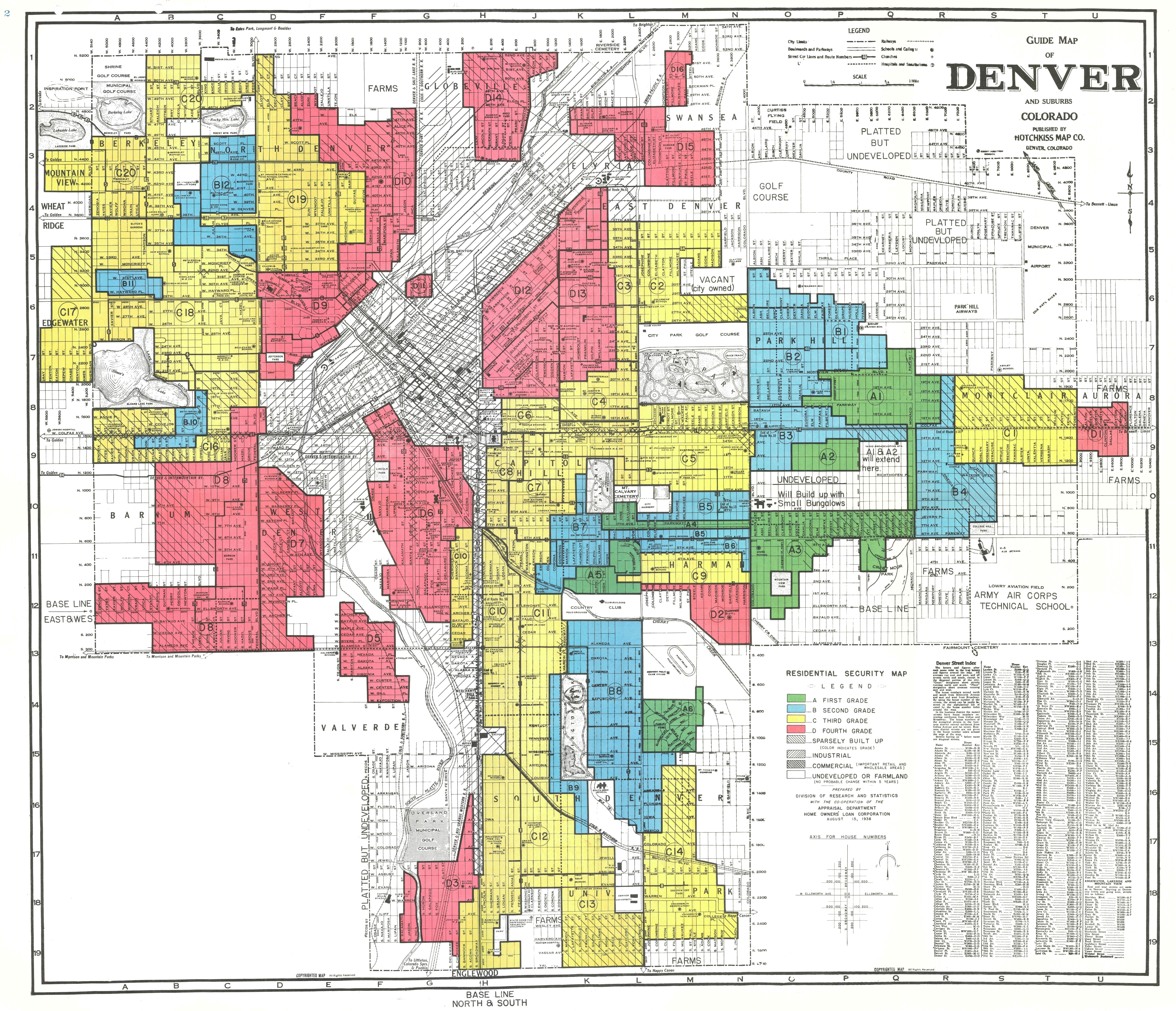
The map (right) of Denver, CO was produced in 1940 with the colors representing the "security" or riskiness of providing mortgage insurance. Most areas where Black people lived, or lived close to, were colored red and indicated to banks that the neighborhoods were too risky to insure mortgages. This is where the term "redlining" came from. In Denver, many of the "riskiest" districts were actually drawn around people of other races and ethnicities including "Mexicans", "Italians", and "Southern Europeans". In contrast, areas colored green indicated to banks that these were the best (White), most affluent neighborhoods to insure mortgages. Image from Mapping Inequality: Redlining in new deal America

While these race segregation practices were outlawed in 1968, their impacts, including the impacts related to public health (air and water pollution), continue to disproportionately affect people of color in Denver and in more than 200 cities across the United States to this day. To better understand environmental inequalities caused by "redlining" and other race segregration practices, scientists from the University of Colorado Boulder gathered air quality data from across the city Denver to study the complex interactions between air pollution, race, and socioeconomic status. The scientists hope that by obtaining data and determining trends in concrete terms can help with getting legislators, policymakers, and community members all on the same page about mitigating the problem of air pollution in these communities. 

_______________________________________________________________________________________________________

Meet the Scientist(s)

Image

Alex Bradley

Alex Bradley is an atmospheric chemist at the University of Colorado Boulder who is interested in the intersection of air and people. He’s long known that societal structures still exist that put people of color at a disadvantage in society and combined his background in atmospheric chemistry with his passion for environmental justice to study how air pollution impacts communities of color in Denver, CO. To do this work, Alex accessed freely available data from multiple sources (see Data Collection section) to quantify the average concentration of nitrogen dioxide and small particulate matter throughout the city of Denver. Nitrogen dioxide comes from vehicles and power generation. It is a known source of ozone pollution in the summer and particulate matter in the winter. Other sources of particulate matter include vehicle exhaust, cooking, and wildfires.

We asked Alex, What is Denver doing (and NOT doing) to combat poor air quality?

Alex: Denver is working to combat the poor air quality in a few ways. There are efforts to plant more trees in disadvantaged neighborhoods, which would help with air quality and the urban heat island effect. There are also several bills in the Colorado legislature dedicated to improving air quality that have not yet been passed, but do have a good bit of support. Last, the Love My Air campaign, provides fast, accurate air quality data that can help Denverites make decisions about whether to be active outside or not.

It should also be mentioned that Denver is also primed to take action that would make pollution issues worse, the best example being the proposed expansion of Pena blvd, the Denver airport access road. This road cuts through neighborhoods of color and an expansion would worsen harmful emissions in this area.

_______________________________________________________________________________________________________

Data Collection

Variable

Description

NO2

Nitrogen dioxide, measured in a column in units of (mol * m-2) (moles per square meter) from the TROPOspheric MOnitoring Instrument satellite (TROPOMI). 

Learn more about the effects of NO2 on human health here


PM2.5


Small particulate matter less than 2.5 microns in size. This is a modeled dataset from Randall Martin’s group at Washington University in St. Louis. They used satellite data and modeling to produce high resolution country-level predictions of averaged PM2.5 concentrations in units of (µg * m-3) (microgram per cubic meter). 

Learn more about the effects of PM2.5 on human health here


Ethnicity


Data from the 2020 US Census, specifically looking at race breakdown by ethnicity. This means that all the White, Black, Asian, etc. people are Non-Hispanic, while the Hispanic people can be of any race. The Census defines a Hispanic person as “a person of Cuban, Mexican, Puerto Rican, South or Central American, or other Spanish culture or origin regardless of race”. For the “race category, it is not unusual for this group to mark themselves as “some other race”

Percentage of households with public assistance/food stamps/SNAP

Data from the American Community Survey 2020, which includes more detailed information for local officials, community leaders, and businesses to make informed decisions about their communities. This is simply the number of households with public assistance in a census tract divided by the total number of households in a census tract.


TROPOMI satellite measure NO2 concentrations

Launched in 2017, the TROPOMI satellite instrument continually orbits the Earth and takes measurements which allow us to create daily global maps of atmospheric gases relevant for air quality and climate monitoring. Image from the European Space Agency.

_______________________________________________________________________________________________________

Classroom Connections and Supports

Communities of color breathe Denver's worst air

The video below summarizes the findings from Alex Bradley's study and is a great resource to share with students after they have explored the data. A summary of the study can also be found in this CIRES blog post.

Additional Supports

  • Read this article to learn about other environmental inequities in Denver including the number of trees in different parts of the city. You might not be surprised to learn that there are more trees, and therefore more shade, in the Whiter parts of the city. Data visualizations are included.
  • Explore this interactive map to learn more about the Denver's redlined areas. Click on the map to read the "area description" for different neighborhoods that an overview of the houses, the sales and rental history, and of the residents. Note that these "area descriptions" were written in 1940 by the Home Owners' Loan Corporation, an agency of the federal government.
  • Read this article from NPR provides an extensive overview of redlining practices
  • Access Alex Bradley's published paper in the journal, "Environmental Science and Technology", titled Air Pollution Inequality in the Denver Metroplex and its Relationship to Historical Redlining.